
The data from the Analytics reports can be presented in Excel. This makes it possible to make the data more visual and it also makes it possible to use all the Excel functions for data processing.
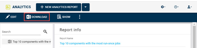
The data can be exported to Excel by clicking the “DOWNLOAD” button.
Since the file downloads from the website, Excel will automatically show the file in protective view.

To edit the file, click on “Enable Editing”.
The Excel file has 4 tabs as standard.
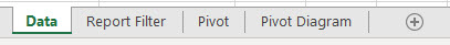
The first tab called “Data” is where the data from Analytics are placed. This tab is only updated by Analytics and therefore may not be modified in the template.
The next tap, Report Filter, is listing the filters that are set up in the report.
Analytics has also created two tabs with a Pivot table and a Pivot Diagram. The table and the diagram is created as a helping tool for the user, as the data is often presented in diagrams and tables.
The user can create extra tabs if needed.
Analytics only requires the “Data” tab.
Create template
In the following example, an Excel template is created to present “Top 10 components with the most run-once jobs” in a pivot diagram.
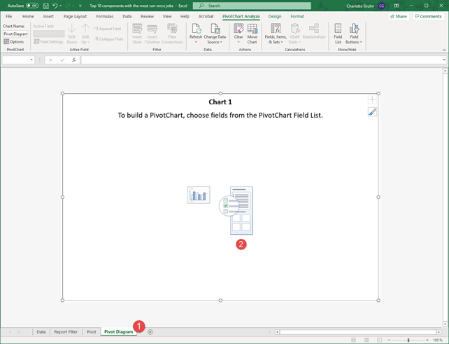
- Click on the “Pivot Diagram” tab.
- Click on the diagram.
By clicking on the diagram, a new menu will open on the right side, from which the diagram can be controlled.
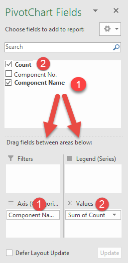
- Drag the field “Component Name” to the Axis box.
- Drag the field “Count” to the Value box.
The columns are now shown in the diagram.
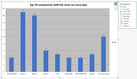
The diagram can be made more readable by, for example, writing an explanatory title and data labels.
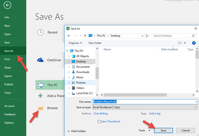
When the data is displayed in the way you would like to see it in the future, the Excel file should be saved.
Remember to save while the "correct" tab is displayed. When the report is later generated, the same tab will be displayed.
The Excel file that is saved should only be used temporarily, and for that reason it is easiest to just save the file to the desktop.
Attach template to report
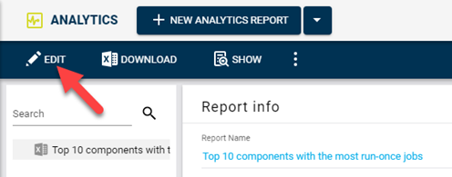
By editing the report, the Excel file can be associated with the INEXTIA report.
Click on “Next” until reaching the “Finalize” page.
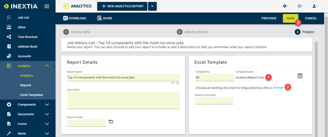
- Either drag the file in from the desktop. (drag to the number 1 and release).
- Alternatively, search for the file on the desktop by pressing "browse".
- When the template file is uploaded, press "SAVE".
The Excel template is now associated with the report. This means that when the report is displayed in Excel ("DOWNLOAD" button), then the latest data will be displayed in the pivot chart.
Other examples
As mentioned, the previous example shows data on the components that have the most run-once jobs.
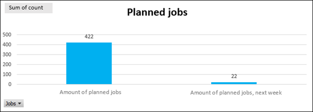
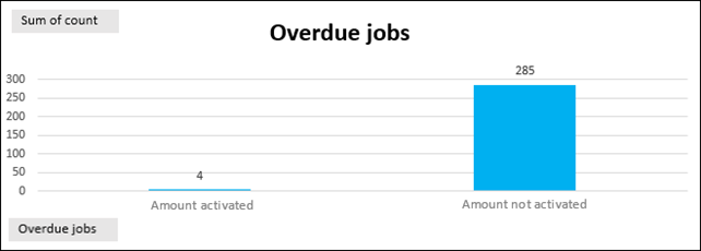
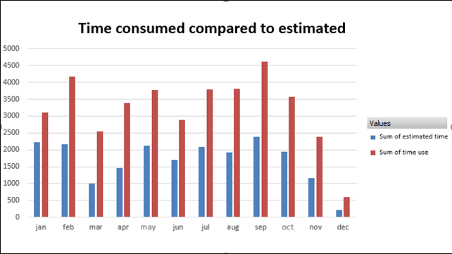
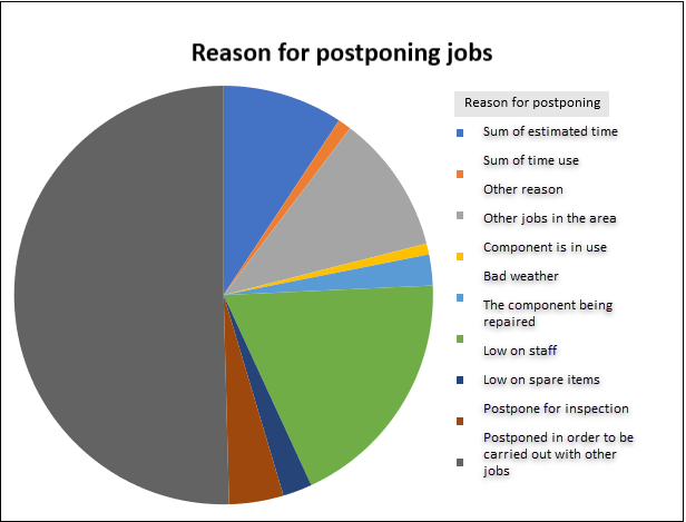
There are many other data that may be interesting to see in reports. Here are some examples:
Comments
0 comments
Article is closed for comments.